*Update: Newer and better versions of these maps are here.
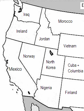
Ever wondered if your state’s climate policy really makes a difference in the big global scheme of things? If so, here’s a little map I made.
For each state, the map shows a nation with equivalent greenhouse gas emissions from energy.
When I’ve shown drafts to people, almost everyone wants to compare populations. The Western states population comparison is after the jump. The full data are here (xls).
Number of people (in millions), 2003
| Arizona | 5.6 | Nigeria | 122.8 |
| California | 35.5 | Mexico | 103.7 |
| Colorado | 4.5 | Cuba + Columbia | 52.9 |
| Idaho | 1.4 | Jordan | 5.5 |
| Montana | 0.9 | Morocco | 31.7 |
| Nevada | 2.2 | Norway | 4.6 |
| New Mexico | 1.9 | Finland | 5.2 |
| Oregon | 3.6 | Ireland | 3.9 |
| Utah | 2.4 | North Korea | 22.5 |
| Washington | 6.1 | Iraq | 24.7 |
| Wyoming | 0.5 | Vietnam | 81.8 |
| Total | 65 | Total | 459 |
I find the full US map a bit overwhelming. Even more so when I realize that the 2003 population of the US—less than 300 million—has the same climate impact as the more than 1.5 billion people represented by the other countries listed on the map.
And now, a word about my methodology. All data are from the US Department of Energy. Ghg data are an average of the period from 2001 to 2003; population data are for 2003. Emissions are from energy use only and they do not include carbon sinks. Countries are considered “equivalent” if their total emissions are within 10 percent of a state’s emissions. Obviously, there a million ways to slice these comparisons since many states and countries have similar levels of emissions.
More information:


jesse.d.jenkins
This is great graphical representation of the scale of the United States’ climate impacts – and the cost of our inaction in the face of the climate crisis. Thank you for posting this.
Arie v.
The planet can only absorb so much carbon and what’s being emitted today is only fractionally increasing emissions developed nations like the US have been responsible for since the industrial revolution. I see a lot of developing countries here that have only recently reached these levels.Though I understand the purpose is to show how significant state policy is, this type of comparison significantly underestimates the share of the problem we shoulder. We’ve already eaten our slice of the pie (and then some) so-to-speak.I’d love to see a cumulative comparison, that would really be an eye opener. That being said this is yet another great visual. Thanks Eric!
Eric de Place
Excellent point, Arie. If one were to factor in historical emissions, the US states would have a far greater impact than the developing nations on the map. (Unfortunatley, I simply don’t have time for that little project this summer!)On the flip side though many of the developed nations, particularly the industrial countries of Europe, have actually reduced their ghg emissions quite a bit over the last 10-20 years. So their contribution may actually be somewhat understated as well.
J Plunkett Consulting
No China? Given China’s projected growth where will it fit in 10 years? I agree that a cumulative comparison would be great; have seen something like it at UWs Climate Impacts GroupThanks.
Eric de Place
J,China’s a massive emitter. It would be something like the entire eastern half of the US. So it would make the map look sort of odd. (Of course, it’s worth keeping in mind that China has 1.3+ billion people, as compared to 300 million in the US.)