How do I love thee, Economic Policy Institute? I would count the ways, but since that would bore most readers, I’ll just make a chart based on their data. (Hey, I’m a romantic like that.)
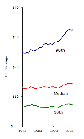
This is US workers’ hourly wages, from 1973 to 2005, adjusted for inflation into 2005 dollars. You’re seeing the median hourly wage, plus the wage at the 10th and 90th percentiles.
This is all workers, mind you, not just workers who are paid by the hour. Kinda funny, I think, how the trend for the median wage mirrors the trend for the bottom 10 percent. But the top 10 percent? They’re having a much nicer ride.


Arie v.
We’ve had earlier debates on this, but Earned Income Tax Credits (EITC) championed by the EPI are an effective tool for bumping up the bottom here, especially for working families who need it most. The EITC vs. minimum wage smack down is showcased hereon the EPI site. The view is that it is a non-debate, we need both. (I agree, but we need the former so much more and waste too much time and energy on the latter.)
Eric de Place
Arie, I quite agree: boosting the EITC is hugely important. I wasn’t intending this particular post to argue for increasing the minimum wage (though I DO think we should do that also, at the federal level). I was simply trying to point out the average American earners are not experiencing the same economy as high earners.
MichelleV.P.
Seems like the world could use more “silly love letters” like this one. Good job!I’m wondering, though, if the top line is mostly measuring the cream of the crop from the booming “dot.com” years? And maybe that’s why it started dipping a bit after 2003?
Arie v.
Eric, Sorry for jumping topics to the solution space, but I can’t see this without thinking about both root causes and solutions. Growing up in Kent in the 70-80’s my family was on that green line…Michelle, You’re spot on especially if this data includes investment income though tech salaries and jobs certainly took a hit. Though I think it was more like 2001-2.
jeannemlarge
Since the post says this is the “median hourly wage”, I’m going to assume that investment income is not included in this data….unless you tell me otherwise, Eric.
Eric de Place
That’s right, it shows wages but not investment income. This omission actually has the effect of reducing the extent to which the lines are pulling apart. Investment income accrues to the wealthy even more disproportionately than do wages.
MichelleV.P.
Good points, all.I’m one who doesn’t much understand the investment game, and so I’m always interested in learning more about it from those folks who do.Sounds like an occasion for another post from Sightline, perhaps.