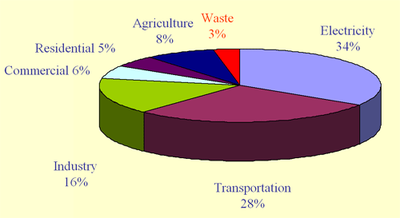
Behold: two very different ways of looking at U.S. climate-warming emissions, thanks to the Oregon Department of Environmental Quality (pdf presentation here). First, the geeky view, with emissions broken out by the specific activities and economic sectors that directly account for emissions:

In this view, electricity and transportation dominate—suggesting that those are pretty good places to look for emissions reductions.
But here’s another, somewhat more personal view—one that fits our “carbon footprint” into the context of our daily lives.

This chart shows that it is our stuff that carries the biggest carbon footprint. Emissions related to buildings (heating, cooling and lighting) are a close second.
Interestingly, the two charts rely on the exact same underlying numbers. Yet they present completely different perspectives on the best leverage points for reducing GHG emissions. Which view is more helpful to keep in mind, for someone trying to fight climate change? I’m not sure. Perhaps neither—since the real key to curbing climate change isn’t finding where emissions are most abundant, but finding where they are most easily curbed.
That said, as someone who’s used to thinking about the first chart—where electricity and transportation dominate the picture—the second chart comes as something of an eye-opener. How we get around town is certainly a big deal. Yet as harmful as personal vehicles are to the climate, I probably should be paying a bit more attention to my stuff.


Milan
Three dimensional charts are a notorious way of presenting information in a misleading way. They emphasize the size of the front-facing segments and de-emphasize those behind.Given how people perceive the area of colour on a chart more than the angular measure of a pie slice shown at an oblique angle, it is more honest to stick to 2D pie charts.
Sungsu
I was going to post something similar to Milan. 3D pie charts may be more pretty, but 2D pie charts are more accurate.
Raef
Granted, from a strictly visual sense, pie charts can be misleading. It is hard, however, to be too misleading when the percentages are given.
jeffy
Visual presentation aside, that second graph is very interesting. I’d love to see how the second graph’s slices break down into the first graph’s categories.Too bad the Oregon slide deck doesn’t identify the specific source of the graphs beyond “US EPA”. That’s a pretty big haystack to go hunting this needle in.
Matt the Engineer
In a discussion inspired by this post, the idea of dense housing was raised as a way to save a large amount of heating energy. I just wanted to point out how much “stuff” dense housing can save as well. Condo dwellers quickly learn what items are non-essential and just stop buying them.
Levin
If some of the dense housing is cohousing, or has other means to foster community and cooperation, then people can enjoy more stuff without owning their own personal copy of everything. A friend of mine who lives in cohousing has personal access to all kinds of fun stuff—a pickup truck, a large-screen TV, kayaks, canoes, camping equipment, various bikes, lots of tools, plus a bunch of magazine subscriptions. He only paid for a few of these things. His neighbors own the rest, but he gets to use what he wants, with a little advance planning.If the dense housing is in a mixed-use zone, that saves on personal transport as well as heating. According to the second plot, residents of a net-zero-energy mixed-use neighborhood who share some of their stuff, and buy some of their food at the local farmers market, could reduce their footprint by 60%, today.
pat
Could you explain/define what “provision of goods and services” means? Does it include the transport (that is another category)??
David
Milan and Sungsu – thanks for your comments about 3D pie charts. I hadn’t considered that and will try and avoid them in the future. In any case, my use of the 3D charts were not intended to mislead.Jeffy – at the time the slides were created, the EPA data had not yet been published. To my knowledge, it should be soon (in draft form). However, an EPA representative recently presented a slightly updated version of this information in a public talk, which can be viewed starting on page 79 of this file. You can also contact the author for additional information as to how the results were generated.Pat – “provision of goods and materials” includes emissions associated with manufacturing, transporting, and disposing of goods and materials. Transportation of people is assigned elsewhere. You can compare the two pie charts and see that since total transportation contributes 28% of the nation’s emissions (first chart), if transportation of people contributes 19% (second chart), then transportation of stuff contributes the remaining 9%. Production-related emissions are several times larger than emissions associated with transportation of stuff, and transportation is several times larger than disposal.Clark – I agree that finding where emissions are most easily curbed is important, perhaps more so than knowing where the emissions come from. One thing the second accounting shows us however is that changes to buildings, transportation, and electricity use will not, by themselves, reduce emissions by 75%. It should be noted that all of these emissions are limited to emissions that originate within the geographic boundaries of the US. They exclude the significant quantity of emissions that occur elsewhere as a result of producing and transporting goods for eventual consumption in the US.