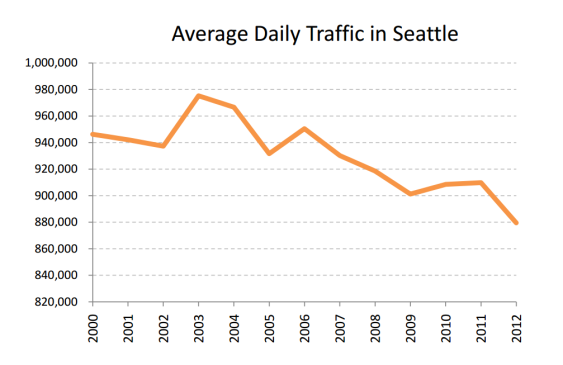
Every year, the Seattle Department of Transportation tracks traffic at 19 select bridges across the city, and presents the resulting traffic count as a rough-and-ready gauge of citywide traffic trends. And based on these counts, SDOT believes that traffic across the city fell by a whopping 10 percent between 2003 and 2012:
But it gets more dramatic. The US Census Bureau says that Seattle’s population grew by 11 percent over the same period—suggesting a drop in per capita vehicle travel of more than 20 percent in a single decade.
Meanwhile, transit ridership in Seattle grew by nearly 40 percent from the early 2000s through 2012:
Of course, these trends are moving slowly enough that most Seattle residents probably don’t notice the changes in their daily lives. In fact, I’d bet that a lot of people stuck in traffic don’t believe that the trends are real. That’s not too surprising, really: when you’re sitting, frustrated, in heavy traffic, it’s very easy to forget that you were also stuck in traffic a decade ago.
Still, the numbers paint a compelling picture of a gradual sea-change in how we get around the city: more transit, less driving. That’s what a slow-motion revolution looks like, folks.


Weezy
That “transit ridership” chart comes from a SDOT report here:
http://www.seattle.gov/transportation/docs/2012%20Traffic%20Report%20final%20v2.pdf
It’s on page 2-3.
It might be as inaccurate and inflated as the Seattle average employment chart below it. That employment chart shows rising Seattle employment since 1990, and something like 1.75 million Seattle jobs. Problem is, Seattle employment is nowhere near that high AND employment here has been flat since 2000.
There now only are about 500,000 jobs in Seattle:
http://www.seattle.gov/economicDevelopment/indicators/JobGrowth.htm
That is about the same as in 2000, as that chart also shows.
Be careful cherry-picking charts from Seattle, Clark. Staff presents VERY different data depending on what point it is trying to make.
Weezy
From this story:
“Meanwhile, transit ridership in Seattle grew by nearly 40 percent from the early 2000s through 2012: [copy of a SDOT chart]”
What that SDOT “Transit Ridership” chart shows is the sum of ALL Sound Transit and Metro boardings, which include many, many boardings that did not begin or end in Seattle. That SDOT chart does not even come close to describing transit use just in Seattle.
The number of 2012 unlinked trips for all of Sound Transit and Metro total about 149 million, which is what that “Transit Ridership” chart shows. That 149 million figure comes from the NTD website:
– Sound Transit: 28.5 million
http://www.ntdprogram.gov/ntdprogram/pubs/profiles/2012/agency_profiles/0040.pdf
– Metro: 120 million
http://www.ntdprogram.gov/ntdprogram/pubs/profiles/2012/agency_profiles/0001.pdf
Lots of those transit trips are in Snohomish County, Pierce County, and King County outside of Seattle. Probably less than half of those 149 million boardings in fact were just “in Seattle”.
Don’t use SDOT charts like this without checking them out first! SDOT staff mischaracterizes data to mislead the public about the extent of Seattle transit users, the number of jobs in Seattle, etc.
Tom Lane
Since nobody can agree, then how about looking at traffic from 1990 to present? How about since 1980? How about traffic in the suburbs? How many people in Seattle are commuting to the eastern suburbs, due to a lack of affordable housing in Seattle? Has congestion in Bellevue and Redmond worsened, while it has declined in Seattle? Irregardless of the answers, Seattle and its suburbs need more freeway lanes, more bike lanes, bike paths, and sidewalks. Since Seattle is all on a grid system with narrow streets, then future upgrades for more lanes and bike-pedestrian accessibility will prove difficult and costly.
bill b
which bridges? can you link to the data? thanks.
Clark Williams-Derry
The bridges are all listed in Table A-1 (which is on page 28) of the pdf in the link below the chart itself. But so you don’t have to scroll…here’s the link.
Matt the Engineer
Per capita traffic chart please!
This is great news.
Clark Williams-Derry
I wish I could, but I’d be reading the traffic volume numbers off the chart.
And thinking about it a bit more, the chart might seem weird: you’d wind up with numbers like “1.7 per capita.” 1.7 what? Well, 1.7 crossings of select bridges, which means what, exactly?
Matt the Engineer
Which means the average person crosses one of our bridges 1.7 times per day, down from 2 times a day 10 years ago (numbers in this example obviously made up). I admit it’s a step toward the abstract. But it’s more normative than the traffic-only chart, as one would expect the per-person bridge crossings to be more steady than the total number of crossings (yet they’re dropping even faster!). But hey, if you’d lose accuracy then it’s not worth it.
John Niles
You can check the average daily traffic volumes on particular Seattle streets of interest to you for any year 1996 to 2012 by examining the traffic flow maps posted by Seattle DOT at http://www.seattle.gov/transportation/tfdmaps.htm.
Still a lot of fat blue lines on these maps, after many years and years. Still a damn lot of cars.
Promoting and facilitating walking, biking, and living closer to where you go every day helps reduce driving of course. Transit helps too, and we’ll find out late on April 22 if taxpayers accept its growing cost.
When the day comes that you want to go further and faster sometimes, especially when accompanied by other people and some of your stuff, a worldwide industry is actively striving to make and sell cars that are smaller, quieter, less emitting, more fuel efficient, safer even if the driver is distracted, less prone to hitting peds, bikes and the car ahead, more connected to help avoid congestion and circling for parking, and more able to be shared.
Despite rhetoric to the contrary, the popularity of cars with millennials is revealed in the charts at http://www.apta.com/resources/reportsandpublications/Documents/APTA-Millennials-and-Mobility.pdf . The emerging characteristics may make cars more popular.
The slow-motion revolution observed in the charts may be an incoming tide that recedes.
Clark Williams-Derry
Yep, agreed, John! Predictions are tough…I try not to make them, since I find that I’m wrong as often as I’m right. And there is an awful lot of driving out there. Even with the per capita declines we’ve seen, we drive a lot more than our counterparts in most other developed nations. And because of that, making cars work better is an important part of our transportation future.