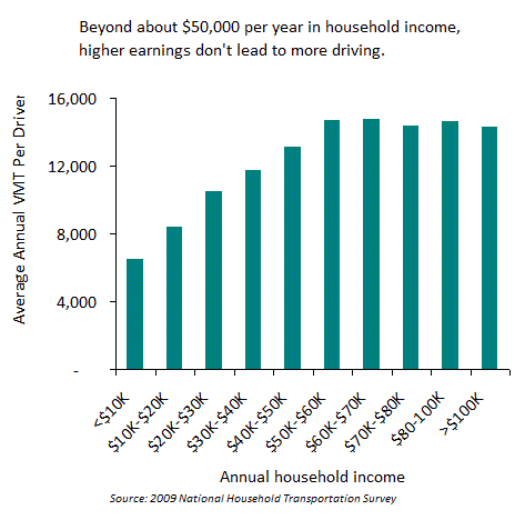
From National Household Transportation Survey data, here are two charts showing how household demographics affect driving habits.
First, there’s income:
Clearly, as income rises, people drive more…but only up to a point! As incomes rise past roughly the US average, driving flattens out. Which makes sense when you think about it: if your salary magically doubled, would you really want to spend more of your time behind the wheel?
This chart may offer a partial explanation for the declines in per capita vehicle travel we’ve been seeing in recent years. Over the past decade or so, incomes for middle class and poor folks have either been stagnant or declining; only the well-off have seen a significant benefit from “economic growth.” But if wealthy folks don’t drive more when they earn more, then today’s skewed version of “economic growth” might not do much to stimulate additional driving.
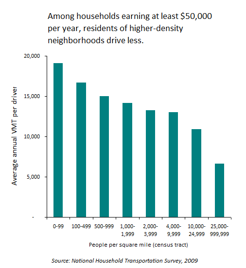
And here’s a second chart, looking at vehicle travel by residential density.
What this chart shows is clear: all else being equal, the denser your neighborhood, the less you drive. Having jobs, stores, and services close by can shorten car trips, and lets some people walk, bike, or take the bus instead of driving. And as neighborhood density rises, some households will find that they don’t need a car at all. (Note: I restricted this chart to households with annual incomes of at least $50,000, to neutralize any of the income-related effects identified in the first chart.)
Academics have studied the relationship between driving and density exhaustively—perhaps too exhaustively, since many spend an awful lot of time quibbling about the specifics. But in broad strokes, the NHTS data confirms what should by now be an undeniable fact: folks who live in compact neighborhoods simply drive less.


Comments are closed.