Do visual symbols of nutrition help us eat healthier? With the USDA recently replacing the confusing and unhelpful food pyramid with a more streamlined plate logo, it’s clear that the way we represent food matters. The food plate’s simple depiction of what a healthy diet looks like has the potential to be extremely effective—it allows people to rate their plate against a healthy standard at a glance.
An effective food icon could have a huge impact on the food choices we make, in-store and at home. So why not piggyback on the release of the food plate with a redesign of our food labels?
Current nutrition labels are a labyrinth of dietary information that most consumers don’t have time to decipher. The FDA has been working, slowly, on an overhaul of the food labeling system since 2005, and since 2010 has toyed with restrictions for front-of-package claims, which are notoriously misleading and have been blamed for contributing to rising obesity levels.
New industry-developed Smart Choices labels, unveiled in 2011, have begun cropping up on everything from cereal to chocolate. The front-of-package “nutrition keys” prominently list calories, saturated fat, sodium, and sugar content. Some products also display information about nutrients such as potassium, fiber, calcium, iron and protein. Yet critics argue that the industry’s efforts don’t do enough to distinguish between good and bad nutrients, and are too selective in the information they provide consumers.
Judging by the mixed reactions and limited adoption, it would seem that it’s back to the drawing board for the FDA’s food labels.
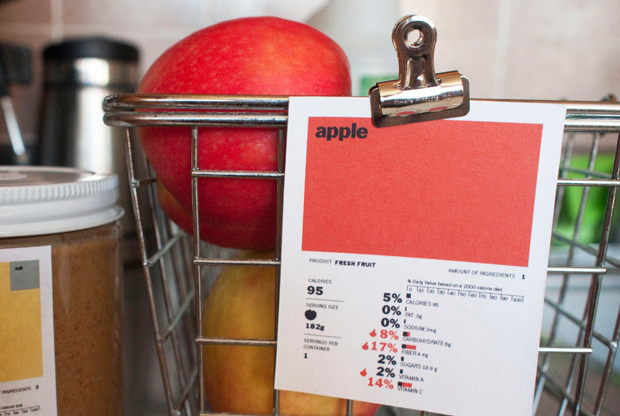
Yet students from the University of California, Berkeley have made it pretty simple for the FDA. The Rethink the Food Label contest at Berkeley generated dozens of new ideas for revising the current mouthful-of-information nutrition label into something, well, a little easier to digest.
In the end, first-place went to designer Renee Walker’s simple color block food labels, which use squares of varying color and size to represent different ingredients and quantities. The use of color to reflect nutrition information benefits visual-learners flummoxed by the existing label’s percentage values. The labels also take a cue from Marketing 101—juice with a big fruit-colored label looks more appealing than one plastered with the gray preservative, additive, and trans fat keys. Simple cues may help people gravitate towards food with better nutrition.
And while we’re redesigning food labels to help us make better nutritional choices, why not consider their power to help us make more sustainable ones too? Nutrition labels that reflect carbon footprints were first piloted by the forward-thinking Swedes in 2009. The labels listed carbon dioxide emissions associated with the production of foods, and appeared on some grocery items and restaurant menus around the country. Britain has similarly begun to develop a carbon footprint label for supermarket goods. The idea is based on The Global Warming Diet’s carbon label, featuring footprint measurements by serving and entire product. They also include the place of origin, method of transportation, and a carbon rating.
Carbon footprint food-labels aren’t without their fair share of problems—here at Sightline, Clark has enumerated the difficulty of accurately measuring our carbon footprint. Accurate food emissions ratings depend on many factors, ranging from the obvious to the obscure.
It’s not just about how the product was transported and whether it’s local and in-season—a true carbon footprint would also reflect the type of soil used, emissions from the factory in which it was produced, whether any cattle feed is local or imported, and a plethora of other factors. For now, the carbon footprint label is largely a rough ballpark of carbon emissions at best, and a misrepresentation of sustainable food choices at worst.
Listing emissions on labels also doesn’t guarantee people will make sustainable food choices, but the potential for change is huge. If the new food guidelines in Sweden were religiously heeded, the country could cut its emissions from food production by 20 to 50 percent. In industrialized nations an estimated 25 percent of emissions can be traced to the food people eat. And sure enough, sales of climate-friendly items rose 20 percent since the start of the pilot program in Sweden.
So perhaps even imperfect carbon footprint labels are worth implementing. Simply the presence of an emissions score may be enough to remind consumers to consider the environmental impacts of their food choices, and take into account what they already know about the importance of buying organic and local. Plus, knowing that their products are being rated on sustainability criteria will greatly motivate companies with poor environmental scores to clean up their act.
As luck would have it, third place in the Berkeley contest went to Dylan Brown’s letter-grade nutrition label, which also included an eco-footprint grade. Hopefully the FDA takes note.
The result of better food labeling? A more environmentally-conscious consumer, publically-responsible manufacturers, and a lighter impact on the planet.
P.S. While we wait for new food labels, a variety of apps for your phone can make it easier to make healthy and sustainable food choices on the go.


Comments are closed.