If you’re an energy geek but you have something you’ve got to get done this afternoon, I’d advise you to go away. Otherwise, you might get sucked in for hours. I sure did.
Every year, BP (yes, that BP) compiles estimates of world energy consumption and production, looking across fuels—oil, gas, coal, and even wind and solar—from 1965 to the present, breaking down the trends by nation and continent. The numbers are always fascinating at least to me. But they’re in a massive spreadsheet that only an accountant’s son (i.e., me) could love.
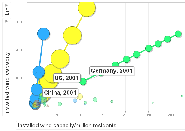
So to help non-Excel addicts visualize the trend, I asked our ever-intrepid Pam MacRae to load the BP spreadsheet into a slick Google “motion chart.”
Click here to see the chart in all its geekalicious glory. (Be warned, it’s big and takes a while to load.)
I’ll be looking at small slices of the numbers—and the interesting stories they tell—over the next few months. But the version above has everything that BP provided, plus data on national population and energy trends per capita. Have fun!
For those not familiar with this kind of chart, here’s how it works…
- Once the Motion Chart loads, you’ll see an array of bubbles. Each bubble represents one nation, and the bubble’s color corresponds with its continent.
- The motion chart lets you plot up to 4 different variables. You can control: X-axis (horizontal), Y-axis (vertical), Color, Size.
- Click on each control to see a menu of metrics you can select from. You can select among oil, gas, coal, various renewables, and total energy; and you can find measures of per capita as well as total consumption.
- Click the “play” button at the bottom to see how the data change over time. (Notice that for a few of the forms of energy, the data doesn’t cover the full span of years. Installed wind capacity, for example, only covers 1996-2009.)
- You can hover your mouse over any bubble to see the name of the country and numeric value for each of the four items plotted.
- To highlight a specific country, select it in the box on the right hand side, or else click on it. This fades out the other countries.
- If you click on a bubble and check the “Trails” box underneath the Size control, you can map out a country’s movement over time.


Comments are closed.