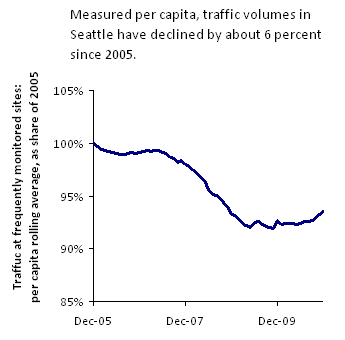
 OK, I swear, this is the last one of this series I’m going to post for a while. But a helpful staffer from the Seattle Department of Transportation was kind enough to send me the city’s traffic “tube count” database. (Thanks, Vince!) And after I played around with the numbers for a while, the chart to the right popped out—showing that, person for person, Seattle residents are driving less than they used to.
As far as I can tell, per capita traffic volumes are down about six percent over five years. Most of that decline took place during 2008, when gas prices spiked and the economy tanked. But even as gas prices plummeted and Seattle’s economy picked itself up a bit, driving ticked upwards only a hair.
The total traffic volumes tell a similar story—rapid decline during 2008, and ending 2010 only a wee bit below where they stood at the end of 2005. And, of course, the numbers I have end in December of 2010—so they don’t reflect any reductions in driving from the most recent round of gas price spikes.
The reason I’ve been so obsessed with traffic trends—with five posts in two months—is that so many of the Northwest’s highway projects are being touted as the solution to our ever-worsening traffic woes. If we don’t build new roads, we’re told, the traffic models predict that we’ll be mired in gridlock. But the gridlock isn’t actually a prediction. It’s more like an assumption, built into the structure of the models themselves. In essence he models take it as a given that as the region grows and becomes more prosperous, people will drive more. That’s what they did last century, right? But over the last decade, we’ve seen a very different—and very surprising—pattern: in case after case after case, traffic volumes are flattening out. They’re growing slower than the models predicted—or they aren’t growing at all.
All of which raises the question: should we really be spending so much money expanding our road network if the demand isn’t actually there anymore? Couldn’t we be doing something a little smarter with our limited dollars?
A couple notes about the methods, for all you traffic geeks out there. SDOT makes somewhere around 2,000 traffic volume recordings each year. And a handful of those recordings are taken at the same location almost every month. To make the chart, I looked only at the sites with a reasonably continuous monthly data series from January 2005 through December 2010. I took a 12 month rolling monthly average for each such site, and summed those averages to come up with an estimate of recent traffic volumes throughout the city. In some places, there were gaps—which I decided to ignore. (If I could find numbers for, say, 10 months out of the previous 12, I just assumed that the average monthly traffic at that spot was the average of those 10 months.) The result is a smoothed time series, representing my best guess at the traffic volume trends around the city. Then I used census population estimates to calculate per capita traffic trends.
So to be clear—the chart above is an estimate of per-capita traffic volumes, based on SDOT data but not endorsed in any way by SDOT itself. Clear enough? If not, don’t hesitate to ask for clarifications in the comments!!

Comments are closed.