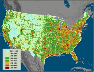
There was some hubbub a couple of weeks ago when researchers produced a carbon emissions map of the US. Using direct CO2 emissions, we saw this first-of-its-kind map:

Unfortunately, the map looks a lot like a population density map. That’s for obvious reasons, since the larger share of cars, buildings, and industry tend to be where the people are. But by turning major cities red, it leads one to the wrong conclusion. Looking at the map, you might think that the northeast was the nation’s big carbon problem, while the dessert West and the Rockies were doing something really right. And I suppose that’s true on one level: there’s not a lot of carbon being emitted in the wide open spaces of the West.
But check out what happens when the researchers added population density to calculate per capita carbon emissions. It’s a completely different perspective:

On this reading, the real problem is the West. The nation’s cool spots are the relatively densely-settled eastern areas.
Now, we all know that per capita emissions don’t matter a whit to the atmosphere. All that matters is the total amount of carbon. But without understanding the population-based side of the equation, we’re unlikely to understand how to fix our emissions problem. The key, as it turns out, is not for our economy to function like it does in West Texas or Wyoming, but more like it does in cities.
Links to bigger version and explanations are here.


Matt the Engineer
The real problem is apparently Texas.Of course that’s probably because of air conditioning, not necessarily because of Republicans. I’d be curious to see what happens on the other side of that border.Actually, I’m not sure I believe the 2nd map. We certainly drive enough on this coast to have high emissions compared to dense cities with good transportation, but we’re higher than the coal-heavy south? I’ll wait for their promised update using better data.
Dan Staley
An easy way, Matt, to check is to look at the per capita VMT for the West.
Matt the Engineer
Do you have a source for VMT per capita by state? Of course even if WA drives more than say Arkansas, I’m still not convinced that gasoline is the highest source of carbon in the US. In fact, this* tells me it’s not. In fact, the greenhouse gasses from coal alone are more than car, light truck, and heavy truck emissions put together.* Greenhouse gas emissions by sector, source here
James Geluso
I took a close look at the Bakersfield area. The areas around Bakersfield are red, while the city itself seems green, and L.A. and metro south are bright shiny green.But I suspect that what’s making Bakersfield red is, in part, the oil industry, the refineries, which generally make fuel for export to nearby areas. So drivers in cities look green because some of the carbon emissions they cause are externalized to other areas. That could explain West Texas, too. Just a hypothesis.
Dan Staley
Matt:Sorry it took me so long to reply. Do you have a source for VMT per capita by state I don’t, without doing some work. However I have raw data.You want to start at the NHTS (say Nitsa) which comes out of the Bureau of Transporation Statistics.First, a region breakdown for 1995 NHTSa. There are some nuggets in there that explain, say, W TX (rural driving, suburbs). Can’t say my initial assumption is borne out in these data, though. Now, disaggregated VKT (kilometers) by state for 2002Sorry about not having a direct answer – just can’t make it happen right now. My initial assumption about VMT may not be correct, judging from the 1995 NHTS, although W TX rural driving sure does account for the orange there.
Matt the Engineer
The region breakdown link seems to indicate that the west drives less per capita than the average US driver. The worst offenders seem to be the South Atlantic region.So again, that second map doesn’t seem logical to me – or at least isn’t explained by VMT.(thanks for the research though)
Dan Staley
Matt:Here is the VMT stats sheet for 2006. Look at the red spots in the West and correlate them with VMT – a lot of these smaller cities have high VMT.Sorry for the delay.