Awesome. I’ve always wanted something like this: a city by city map of affordable housing, indexed to local wages. But wait, there’s more!
This map combines both housing and transportation costs. The result is maybe a bit surprising. In-city areas tend to look pretty good, while far-flung suburbs—where you get a lot of square footage (and lawnage) for your money—don’t look so good at all. It makes a little clearer the tradeoff between floor space and travel costs, which tend to be higher than buyers imagine. Especially these days.
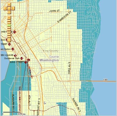
In the maps below, the pale areas show places where housing + transportation are 45 percent or less of median income. It’s higher than 45 percent—and therefore not “affordable” by this definition—in the blue areas.
 Over at Slog, Erica Barnett went to all the trouble of posting screen captures of the greater Seattle area. So I’m shamelessly reusing them here. (Okay, I’m feeling a little ashamed, but I’m pressed for time. You’ll find the rest of them below the jump.) And if you don’t live in Seattle, never fear, you can find a housing + transportation affordability index for every major US urban area. The only other city in the Northwest, however, is Portland.
It’s a project of the Brookings Institution in partnership with some other organizations. I haven’t carefully vetted the assumptions or anything like that—and I don’t intend to in the near future—but you can read more about the project here, and you can find the methodology here.
More maps of the Seattle area’s affordability below.

Here’s Seattle’s center city area, including downtown, the Central District, the International District, and surrounding areas.

This is just north of the Ship Canal in Seattle, centering on the Univeristy District, with Greenlake on the left there and Laurelhurst in the bottom right corner.

Here’s a look at the Lake Sammamish area along the I-90 corridor. The pale patch is downtown Issaquah.

And finally, here’s a look at Maple Valley, Black Diamond, and some other areas in the suburbuan-exurban territory.


Alan Durning
Wow! This is very impressive piece of analysis and mapping, and the user interface is intuitive. It’s definitely worth your time to poke around.
Laurence Aurbach
The Center for Neighborhood Technology has been working on the Housing + Transportation Affordability Index for several years, beginning with its analysis of the Minneapolis-St. Paul region. The organization has several other initiatives that are well worth checking out, like its various emissions calculators (listed on the bottom left hand sidebar) and the Location Efficient Mortgages program. The Center for Transit Oriented Development is a joint venture with CNT, and it also is under the umbrella of Reconnecting America. This is another group with a number of good programs, especially its forecasts of TOD market demand, best practices in TOD business and planning, and political advocacy. Some of its materials are available for free on the website.Both groups are aligned with the smart growth and new urbanism movements.
8string
Minor nit with this analysis. I used to live (up until 2005) in Greenlake Area, on the map just about at the NW corner of 50th & Latona NE (corner just west of I5 on 50th). The lines change from white to blue at 50th St, and I have to say that it doesn’t make sense to me to see the changes in that area. The housing prices weren’t all that different (look at the area between 50th and Greenlake for an example). And access to cheap transportation was pretty similar, if not virtually identical. I would have thought it would be yellow across the whole area from 50th on up to Greenlake. The area right around the Good Shepard Center is certainly not cheaper than around where I lived. Anyway, it’s all a great analysis for pondering why people think they live cheaper living further out. Bottom line for me is that people should try and live near where they work.
Laurence Aurbach
8String, you should send your note to the group that developed the maps and supporting analysis. They can use feedback like yours to fine-tune their GIS parameters so that the maps can be more accurate. The contact is: Nicole Gotthelf, 773.269.4029, nicoleg@cnt.org
Quinton Roland
Excellent study! Yes, when I lived in Innsbruck and Venna Austria for 4 years and Brno Czech Republic for 2, my yearly transporation expenses were no more than $1500. $400 for annual transit pass to go anywhere within city limits. Another $1100 for long-distance travel like vacations and visiting friends and family out of town. I owned a car only 1 out of the 6 years living in Europe (1994-2000). Even when I owned a car in Innsbruck I walked, biked and took transit most of the week. When I didn’t have a car I wasn’t aware of it. I was in the best shape of my life. Got my exercise walking, biking and taking transit. No need for a costly gym membership. Saved several hundred dollars there. No vehicle repairs, insurance, maintenance, fees, smog tests, accidents, etc. I could get just about anywhere I wanted just about anytime I wanted without a car. My yearly transportation costs in America are at least $5000 for ownership, operation and related. And I do not possess the same travel mobility and convenience and reliability of timely arrival as I did in Europe. And my taxes keep rising in order to support new transportation funding measures, where 75% of the money goes towards new highway interchanges supporting new sprawl while our $800mil county road repair backlog is passed over. Each time I drive under a tripple-decker highway overpass/interchange hairball it’s easy for me to understand how America’s transportation system is the most costly, most dangerous, most polluting, least healthy and least reliable and least business friendly (including tourism) among most developed nations. Not once in 6 years in Europe did I fret about vehicular rush-hour traffic. I knew that one of my choices could get me there in no time because I was part of a travel “system” of maximum freedom and choice and coverage and affordability for all modes of travel. In America I am hostage to one choice. My friends from Europe were shocked to find their only viable choice to reach me from San Francisco was by car rental! It was as if they were visiting a third world country. The day Americans get it into their stubborn heads that our transportation system is a heavily subsidized and monopolized and socialist proposition, they will begin to favor alternative higher performance systems. Isn’t America in favor of getting the biggest bang for their buck? Isn’t American obsessed with high performance? With freedom…of choice? With equity and equal opportunities for all? This nation was built on village style development. It is precisely those historic villages that work the best economically, socially and environmentally (and militarily) in modern America, for the pedestrian, the bike, the bus and the car.That study inspired me! Thank you.
Jonathan Harrington
We hear a lot these days about how our transportation choices affect the climate. What is the climate ‘cost’ of driving? There is a HUGE difference in carbon dioxide (CO2) impact between different types of vehicles. Here are some examples of yearly emissions for some top selling brands (figures assume 12,000 miles/year).Toyota Prius…….5,160 pounds of CO2/yearHonda Accord….9,760 pounds of CO2/yearDodge Caravan…12,260 pounds of CO2/yearHummer H-3……15,420 pounds of CO2/yearFord Expedition..17,000 pounds of CO2/yearAnd for the money is no object crowd:Ferrari F430………18,760 pounds of CO2/yearAnd the subway….665 pounds of CO2/yearFor more information on climate friendly transportation choices and other ways that you can reduce your carbon footprint, visit http://www.climatediet.com .
eric
I’m sorry, but looking at the CNT maps of affordability, based on a 30% median income, I just don’t buy their data. I spent 6 months last year looking for a house on Whidbey Island, and their affordability maps don’t seem to have any correspondence to what I was seeing on the ground. Areas that I know have million plus homes are listed as affordable, and ones with 10 acres and a singlewide are listed as not. Waterfront on Saratoga? affordable. Goss Lake, not? Langley, Affordable? I just don’t believe it. In Seattle, It’s the same way. Fremont? Expensive. Wallingford down to Gasworks? Big houses, views, established neighborhoods? Expensive. Note that this is without factoring transportation into the mix, and therefore should be somewhat easier to back check for some reasonableness.
orlndotax
http://www.orlandofltaxi.com
taxi, taxi orlando,transportation
321-299-5921