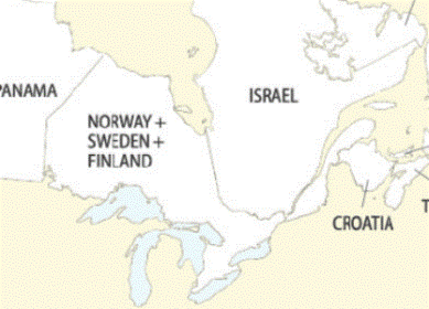
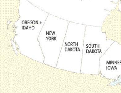
Okay, this is becoming an unhealthy obsession. I promise to stop soon. But before I do…
Ever wondered how Canada’s greenhouse gas emissions stack up to other countries? To the US?
If so, then feast your eyes on these, my friend. (See here and here for better versions.) The maps below show Canadian provinces labelled with countries or states that have equivalent greenhouse gas emissions from energy use.
Full versions—available in bigger sizes—are here and here.
Detailed population comparisons are below the jump.
| 2003 population, in millions | |||
| AB | 3.20 | Argentina + Chile | 54.4 |
| BC | 4.20 | Denmark | 5.4 |
| MB | 1.17 | Panama | 3.0 |
| NB | 0.75 | Croatia | 4.5 |
| NS | 0.94 | Tunisia | 9.9 |
| NL | 0.52 | Guatemala | 11.5 |
| NT + NU | 0.04 | Barbados | 0.3 |
| ON | 12.41 | Sweden + Finland + Norway | 18.7 |
| PE | 0.14 | Namibia | 1.8 |
| QC | 7.55 | Israel | 6.1 |
| SK | 0.99 | Columbia | 41.7 |
| YT | 0.03 | Saint Lucia | 0.2 |
| Canada | 31.9 | Countries | 157.4 |
| 2003 population, in millions | |||
| AB | 3.20 | New York | 19.2 |
| BC | 4.20 | Oregon + Idaho | 4.9 |
| MB | 1.17 | South Dakota | 0.8 |
| NB | 0.75 | Maine | 1.3 |
| NS | 0.94 | New Hampshire | 1.3 |
| NL | 0.52 | Rhode Island | 1.1 |
| NT + NU + YT | 0.07 | Washington, DC | 0.6 |
| ON | 12.41 | Minnesota + Iowa | 8.0 |
| PE | 0.14 | Guam | 0.2 |
| QC | 7.55 | Alaska + Hawaii | 1.9 |
| SK | 0.99 | North Dakota | 0.6 |
| Canada | 31.9 | US places | 39.9 |


Sungsu
Yep, it takes a lot of energy to extract oil from the tar sands in Alberta. 🙁
nbc
Huh? When you contrast the carbon usage of poor countries with some provinces (e.g. Alberta versus Argentina and Chile) and then, in the same chart, contrast rich countries with other provinces (Quebec versus Israel), your intended message becomes utterly unclear. You should factor GDP into the comparison.
Eric de Place
Sungsu,You said it. Interestingly, in the U.S., Wyoming and some of the states on the Gulf of Mexico have similarly high ghg emissions because of their energy industries.nbc,I’m not sure what you think my “intended message” is. The point of the maps is simply to emphasize that Canada’s ghg profile is of global significance. Awhile ago, I did a version for the U.S. and a few folks expressed interest in seeing how Canada compared. There are, of course, many ways to further parse national ghg emissions—population, GDP, major energy sources, geography, etc. I included some population numbers because the vast majority of people I shared drafts with wanted to know the populations. Incidentally, I’m not sure I’d classify Argentina or Chile as poor countries. Both countries have right around double the world’s per capita GDP.