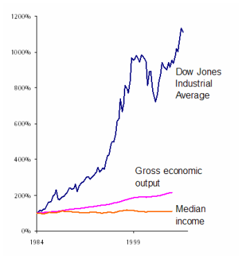
It’s high times for the Northwest’s economy, right? Stocks are soaring. Our region’s GDP is up too. But the prevailing gauges provide a crooked accounting of how the economy affects ordinary people.
So to straighten out the books, Sightline’s Cascadia Scorecard 2007 (just released today) shows that the Northwest’s economic security is scarcely better off than it was more than a decade ago. For all the attention that we give to our pocketbooks in our personal lives, policymakers have little information about the financial security of working families.
Consider, for example, median household income, an excellent gauge of middle class well-being.
Since the mid-1980s the Dow has risen nearly tenfold, and real economic output in Cascadia has more than doubled. By comparison, middle-class incomes in the region scarcely budged. (And keep in mind that the Dow has virtually no bearing on most people’s pocketbooks: the wealthiest fifth of Americans own 90 percent of all stock-market assets, while the bottom three-fifths of Americans own a scant 3 percent.)
So what does a more accurate gauge—the Cascadia Scorecard—tell us about economic well-being? It’s a different story:
- Median income isn’t much higher today than it was in 1990. After adjusting for inflation, it’s slightly higher today than it was in 1990, yet it remains several thousand dollars below its 1998 peak. In British Columbia, the picture is grimmer: although median income has improved a bit recently, it’s still roughly 6 percent lower than it was in 1990.
- Many northwesterners still face precarious economic conditions. After years of ups and downs, by 2005 (the most recent year of complete data) the poverty rate remained unchanged from 1990, while the child poverty rate was slightly lower and the unemployment rate slightly higher.
As it turns out, the very composition of the Scorecard’s economy indicator points out a serious problem: the mostly widely reported economic indicators have little connection to the daily fortunes of ordinary families. As a society we do a poor job of measuring what matters to most of us.
It’s not that we lack for financial measurements. Far from it. Open any newspaper and you’ll find a whole section devoted to reporting the latest developments in hundreds of business trends like consumer confidence, retail sales, and, especially, the stock market. In fact, every major US media outlet—from radio to television to websites –provides frequent updates on the often meaningless vacillations in the Dow. But there’s scant attention to declining household incomes and stubbornly high rates of poverty.
Yet without an accurate gauge of real-life economic security, Cascadia’s leaders are flying blind, with only a rudimentary compass to guide them. So while many innovative reforms could help boost Cascadians’ financial well-being, it will be impossible to know if they’re working until there is a reliable, regularly updated gauge of the financial health of ordinary working families.


Arie v.
If the stock market is in a slump, Congress and the Executive branch are held to account. If median wages are stagnant little happens as there is little visibility. I’m also not sure median household income is the best – or sexiest way to measure – we need better indicators. On that note, a minor nit. It is important to adjust for inflation to show median wages are stagnant, but to be fair we should also adjust the Dow as well to avoid being accused of juicing the numbers. The disparity will still be dramatic.
Eric de Place
Nice catch, Arie. On the chart, both median income and gdp are adjusted for inflation; the djia isn’t. (In inflation-adjusted terms the djia “only” quadruples during the same period that median income is basically flat.) But there’s a rhetorical point to make here, and it’s a reason to leave that the djia un-adjusted in this particular chart. Reporting on the Dow is enormously influential in shaping how we think about the economy. And the reporting—which happens every day, every hour, and every minute—never, ever, ever adjusts for inflation. The result is that we get a sense that things are always headed up when they’re actually not. So the point I’m trying to make is that there’s a big difference between perception (the djia) and reality (median income). I should mention too that the djia is an absolutely horrible indicator, even of the stock market. It’s just plain nutty. But I’ve probably beaten that horse carcass a few too many times already.
Dan
The result is that we get a sense that things are always headed up when they’re actually not. So the point I’m trying to make is that there’s a big difference between perception (the djia) and reality (median income). Yes. On a bad day I say the innumeracy of America is purposeful. Importantly, we also don’t adjust our numbers for population growth when we hear things like “more people did X than ever before!!!! (per capita or per 1000 would tell a better truth).
Arie v.
Adjusting for population growth is a sharp point, I think we could go on for awhile here. I just happened to be reading this from http://www.bankrate.com as to what the numbers show vs. what they tell us in housing: In May, sales of houses costing more than $500,000 were up slightly compared to the previous May. Sales of less expensive houses were down—and when you get to houses costing less than $150,000, the drop is steep indeed—from 18,000 sold in May 2006 to 12,000 sold last month.This “Two Americas” phenomenon, in which wealthy people continue to buy expensive houses while the rest of us don’t, is behind the weirdness in prices. Half of the houses sold in May cost more than $236,100—virtually unchanged from the median price in May 2006 of $238,200. But the average price rose briskly, helped along by strong sales of expensive houses. The average new house price in May was $313,000, a 6.5 percent increase over the May 2006 average price of $293,900.Even the housing bubble has two very different sides.