A nice map in yesterday’s Post-Intelligencer shows that where you live really does affect your health. Life expectancy (which is generally considered the best single indicator of the health of a population) varies by up to 15 years among US counties, and shows some interesting (though not unexpected) regional trends.

The northwest doesn’t do too badly—not as good as the upper midwest or northesast, but not as bad as the southeast.
But what’s interesting to me about the map is what it leaves out: Canada.
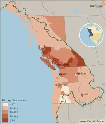
Take a look, for example, at a similar map we did a few years back, looking at life expectancy in “Cascadia” (roughly, Oregon, Washington, Idaho, and British Columbia).
Look how life expectancy goes up just north of the 49th parallel—especially in the southern and more urbanized part o fhte province.
For a variety of reasons—univeral health care, lifestyle, neighborhoods that do a better job of fostering walking and reducing risky long-distance car travel, and perhaps even a more equitable (and therefore less stressful) economy—British Columbians are simply healthier than their counterparts to the south, and live about 2 years longer, on average.
Of course, lifespans have been going up for most of the last century, and are showing no signs of leveling out. So if recent trends continue, residents of the the northwest US will catch up to BC within the next 20 years or so. But BC residents are likely to get healthier too—and if the past is any indication, they’ll get healthier faster than us folks in the US northwest. By the time we catch up with where they are now, they’ll have extended their lead to about 4 years.
As large a country as the US is, we tend to be a bit provincial—we’re more likely to compare ourselves to ourselves, rather than to other countries in the world. But if we broadened our horizons a bit, we’d see that a focus on within-country trends may obscure a bigger lesson: even the healthiest parts of the US aren’t particularly healthy, compared with the rest of the industrialized world.


charliew
Clark—Is there similar/comparable map-based lifespan data for other parts of the world, like Mexico/S. America, Europe, Asia, Africa? Just to get a little more perspective.
Jan
Bravo for your continued bi-national, bioregional point-of-view!Since my immigration to Canada this year, I’m slowly eliminating all the bleeding-heart groups I had been supporting that have a US-only focus.”Comparison” to most Americans means comparing Mississippi to Alaska. Nine out of ten Americans I talk to are convinced the US has the best health care and longevity in the world, and are startled to see how far down the list the US actually is.Keep up the good work!