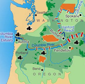
Here at Sightline, we’re enamored of good visuals–especially maps that tell stories. So I was pleased to find a terrific interactive map published by Save Our Wild Salmon. Scrolling across features in the Columbia-Snake River basin, users learn the story of salmon conservation.
I’m not just talking about pop-up windows that describe the dams and wilderness areas (it has those too). I’m talking about clickable icons that activate movie clips. You hear real people tell their stories of life in a faltering salmon economy, and you see compelling images of the places where people and salmon meet. It’s nice work.
Click here to see the full map.






Seth Zuckerman
Indeed a cool map. I hate to point out a misleading statistic, because I’d like to see the Snake run free as much as the next salmon-lover, but here’s what I noticed: the hydro contribution of the Snake River dams is noted in aMW, or average megawatts, while the size of all the other dams is measured in their MW of capacity—the number of average megawatts they would attain if they ran full bore, 24/7. Not a fair comparison, because it makes the Snake River hydro dams seem less significant than they really are.