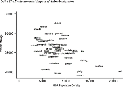
I just stumbled upon this chart that illustrates the relationship between density and driving.

Left axis is household vehicle mileage; bottom axis is metroplitan density. If you squint, you can find Seattle right in the middle of the cluster. Portland is about the same density, but with higher household mileage. You can find a bigger and clearer version on page 6 of this pdf.
Admittedly, this chart may be old news to some folks: the study was published in 2000, and it uses 1995 data. And though you can see the correlation pretty clearly, density obviously isn’t the only force in play. Nonetheless, the study found:
Suburban households drive 31 percent more than their urban counterparts, and western households drive 35 percent more miles than northeastern households.
Anyway, I thought it was a pretty snappy depiction of how land use may be in the driver’s seat for, uh, driving.


Patrick McGrath
The report “Driving to Green Buildings” explores this idea, and uses a similar graph (derived from Victoria Transport Policy Institute data) to illustrate the point:http://www.buildinggreen.com/articleimages/1609/density.jpg…and it includes a correlation coefficient.
jal
What I find interesting is the finding that overall metro density explains driving mileage much better (6x) than does local (census block) density CONTROLLING for distance from city center (I think). This finding is shown in the regression table on page 4 of the linked paper. It still seems that the analysis is missing something, perhaps regarding workplace distribution ‘maturity’ (e.g. are there viable workplaces throughout the metro or just downtown)
Richard
Cool data. A couple of things. I’m curious what the regression would show for 0 vehicle miles. Would we reach the density of a neutron star (1 x 10^18 kg/m^3)?Also, I wonder what the error bars are for some of those cities. I assume we see the averages but I’d like to see the relative ranges for each city. That would tell us which ones have a few people driving a lot and a lot driving a little.