(*Update: Newer and better versions of these maps are here.)
Because I love maps so much that I just can’t stop making them.
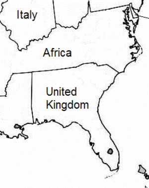
This version is a bit a more conceptual than the previous map. But even though it’s a bit weirder, but I actually like it more because it really drives home the outsize significance of US climate policy.
Each state, or cluster of states, is labelled with a country or continent that has equivalent greenhouse gas emissions.
The 291 million in Americans (in 2004) is the greenhouse gas equivalent of the more than 3 billion residents of other countries listed on the map.
The detailed population comparison is below the jump…
Number of people, 2003 (in millions)
| Africa | 853.2 | 42.1 | AR + DC + KY + MD+ MO + NC + TN + VA + WV |
| Argentina | 38.7 | 7.5 | AZ + NM |
| Brazil | 182.0 | 9.4 | IA + MN + ND + SD |
| France | 60.2 | 35.5 | CA |
| Germany | 82.4 | 51.7 | NJ + NY + OH + PA |
| India | 1,049.7 | 33.0 | LA + MS+ OK + TX |
| Indonesia | 234.9 | 15.5 | MI + WI |
| Ireland | 3.9 | 3.5 | CT |
| Israel | 6.1 | 0.5 | WY |
| Italy | 58.0 | 18.8 | IL + IN |
| Jordan | 5.5 | 0.8 | DE |
| Malaysia | 23.1 | 10.7 | MA + ME + NH + RI + VT |
| Morocco | 31.7 | 0.9 | MT |
| Pakistan | 156.1 | 4.6 | NV + UT |
| Philippines | 84.6 | 6.1 | WA |
| Sweden | 9.0 | 4.9 | ID + OR |
| Thailand | 63.3 | 9.0 | CO + KS + NE |
| UK | 60.1 | 34.4 | AL + GA + FL + SC |
| Norway | 4.6 | 0.6 | AK |
| Ecuador | 13.1 | 1.2 | HI |
| Total | 3,020 | 291 | Total |
The full map for the US is here.
The methodology is the same as the last time around. All data are from the US Department of Energy. Ghg data are an average of the period from 2001 to 2003; population data are for 2003. Emissions are from energy use only and they do not include carbon sinks. Countries are considered “equivalent” if their total emissions are within 10 percent of a state’s emissions. Obviously, there a million ways to slice these comparisons since many states and countries have similar levels of emissions.


